National Coverage
Once data quality is assured, denominators selected, and numerators adjusted, the Data Suite synthesizes everything into coverage estimates—the core metric that answers: What proportion of the population needing a health service actually received it? This module generates annual coverage estimates for reproductive, maternal, newborn, child, and adolescent health indicators by dividing adjusted numerators from facility reports by the best-performing population denominators. Coverage estimates are then compared with recent household survey results to validate findings and identify areas of systematic bias.
Coverage estimation must account for operational realities: some indicators (institutional deliveries, immunizations) reach implausibly high levels (>100%) due to data quality issues or duplicate recording, requiring reframing as average services per capita rather than percentages. Family planning coverage is handled through specialized demographic modeling (FPET) that integrates multiple survey data sources and can incorporate facility data quality permits. The module produces trend lines, comparisons with global targets (e.g., 90% institutional delivery by 2025), and side-by-side facility-versus-survey visualizations for credibility assessment.
Coverage in CD2030 Analytical approach
Antenatal care (ANC)
Most countries have at least one ANC indicator with a target in the national plan. The global ENAP/EPMM coverage targets for 2025 are: globally, at least 90% of pregnant women with 4 or more ANC care visits, and 90% of countries with at least 70% coverage. There are several ANC indicators that capture:
- Contact with health services during pregnancy (ANC 1st visit, ANC 4 or more visits, ANC first visit in first trimester). ANC1 is often considered an indicator of basic access to health services. It is high in most countries, and in many instances, the numbers of ANC1 visits in the routine health facility data can provide a better denominator for the ANC and delivery indicators than population projections (see section 2 on denominators).
- Contents of services provided (intermittent preventive therapy (IPT2 or IPT3) against malaria, HIV testing, syphilis testing and iron-folic acid (IFA) supplementation (at least 90 tablets given to the pregnant woman)). Some countries will not have policies for all of these diagnostic or therapeutic interventions during pregnancy (e.g., no IPT if no malaria risk).
For most indicators, the surveys also provide coverage estimates for the national level, with 95% confidence intervals. For most coverage indicators the data refer to a period before the survey: e.g., institutional birth coverage for the live births in the two years preceding the survey. This means that the midpoint of the coverage estimate lies one year before the survey.
Sometimes, an indicator may reach an unlikely high coverage at the national level, say over 125%. This may be because the data quality of the numerator of the coverage indicator is poor, the denominator is wrong, or the intervention is given and recorded more than once during pregnancy. An example is IFA supplementation. In that case, the computation of coverage is not useful. It is better to express it differently. For instance, if coverage is 200%, it is better to compute the average number of courses of 90 IFA tablets that a pregnant woman received (in this case 2.0 per pregnant woman in the population).
Delivery Care
All countries have at least one delivery care indicator with a target in the national plan. The global Every Newborn Action Plan (ENAP) and Ending Preventable Maternal Mortality (EPMM) coverage target for 2025 is at least 90% global average coverage, and 90% of countries with at least 80% coverage of skilled birth attendance (SBA). For postnatal care (PNC) within 2 days, the global coverage target is 80%, and 90% of countries with at least 60% coverage.
Institutional (live) birth coverage and SBA are closely related, as almost all deliveries with a skilled attendant occur in health facilities. From the analytical perspective, institutional birth coverage is preferred because it is a more objective measure and avoids issues with varying national definitions of what constitutes a skilled birth. SBA is often preferred from the healthcare perspective because it includes an element of quality; obviously, an institutional delivery without skilled attendance is not desirable, and in some countries, home SBA may be part of the healthcare delivery strategy. Either indicator works well to capture delivery care.
Caesarean section is a life-saving intervention and an important indicator. A general rule of thumb put forward by the World Health Organization (WHO) is that the population-level need for Caesarean section is in the range of 10–15% of all deliveries.
- Below 10%: Indicates an unmet need for surgical delivery care.
- Over 10–15%: Implies a likely overuse of Caesarean section. It may also imply a combination of unmet need among certain population groups (e.g., the poorest or rural women) alongside overuse in other subgroups (such as urban and wealthier women).
Postnatal care (PNC) within 48 hours is provided to the mother and newborn. Country systems vary in how they record the type of PNC, and household surveys are known to have data quality issues regarding PNC for the mother or the baby. Some countries use multiple definitions for the timing of the PNC visit (e.g., within the first week).
Low birthweight is a critical indicator of neonatal health. It is most meaningful if the distinction between prematurity and small-for-gestational-age is made, but most facility reporting systems and surveys lack such granular data. All babies are supposed to be weighed immediately after birth, and the percentage of newborns weighing less than 2,500 grams is typically reported in the DHIS2 system. As general guidance for data interpretation, low birthweight prevalence in sub-Saharan Africa was estimated at 13.9% (95% credibility interval: 12.4–15.7%) for 2020.
Immunization
Immunization coverage indicators are included in virtually every country’s health sector monitoring plan. A general target is at least 90% coverage for essential vaccines given in childhood and adolescence.
For national coverage analyses, the focus is on BCG, the first and third doses of pentavalent/DTP (penta1/DTP1 and penta3/DTP3), and the first and second doses of the measles vaccine (often co-administered as measles-rubella). BCG and penta/DTP vaccinations are recommended at birth (BCG), 6 weeks (penta1), and 14 weeks (penta3).
- Facility Data: The number of vaccinations given to infants is used as the numerator. The denominator is the number of eligible children in the population, approximated as:
- Survey Data: Generally provide vaccination coverage among children aged 12–23 months (and may include the age at which the vaccination was administered, typically before the first birthday).
The first dose of measles vaccine is generally recommended at age 9 months. For facility data, recording and reporting usually separate measles doses given to children under 1 year from those given to children 1 year and older, though recording quality by age group varies (there is often a tendency to record measles vaccinations administered after 12 months as given to infants). Here, the denominator used to measure coverage represents children who survived the first year of life:
The second dose of measles uses children aged 24–35 months as the denominator, estimated as:
WHO and UNICEF collaborate with countries to produce annual estimates of immunization coverage using all data sources. These national estimates, called WUENIC, are published and available for 2020–2024. These time trends are included in the analysis outputs to compare the 2019–2024 annual facility data estimates produced in the workshop against the survey results.
Family Planning
Family planning coverage estimates are derived from a collaboration between Countdown to 2030 and Track20. Track20 developed the Family Planning Estimation Tool (FPET), an advanced model focusing on three indicators: modern contraceptive use, unmet need for modern contraceptives, and demand satisfied with modern methods. These three indicators are closely related because:
FPET uses statistical modeling that incorporates all available survey data and can integrate facility data if the quality is sufficient. FPET allows various types of survey data to be combined, fitting a trend line that draws strength from multiple data points and minimizes the risks associated with directly comparing different surveys.
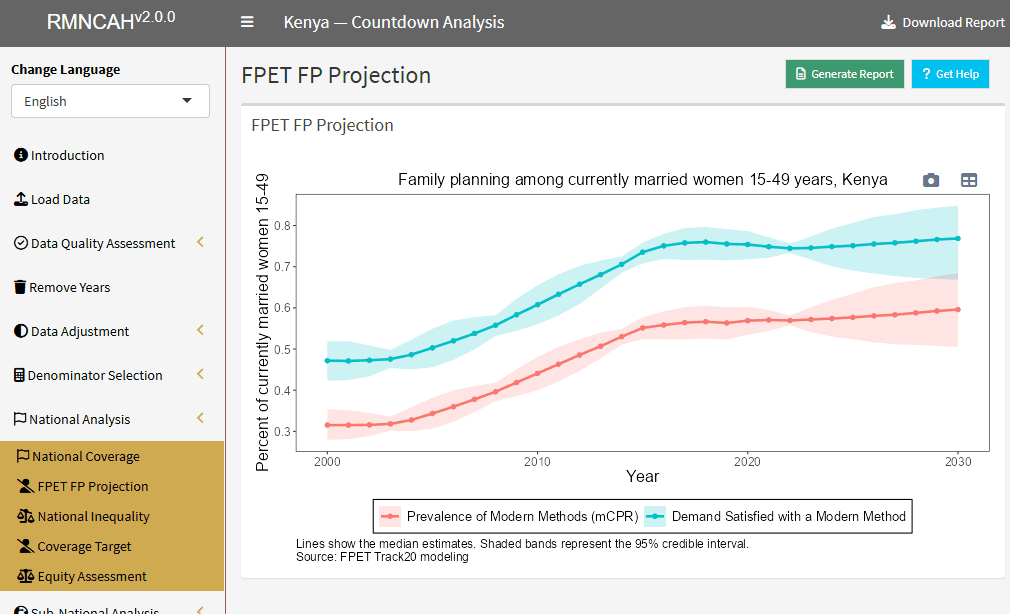
Interpretations
National Coverage trends
-
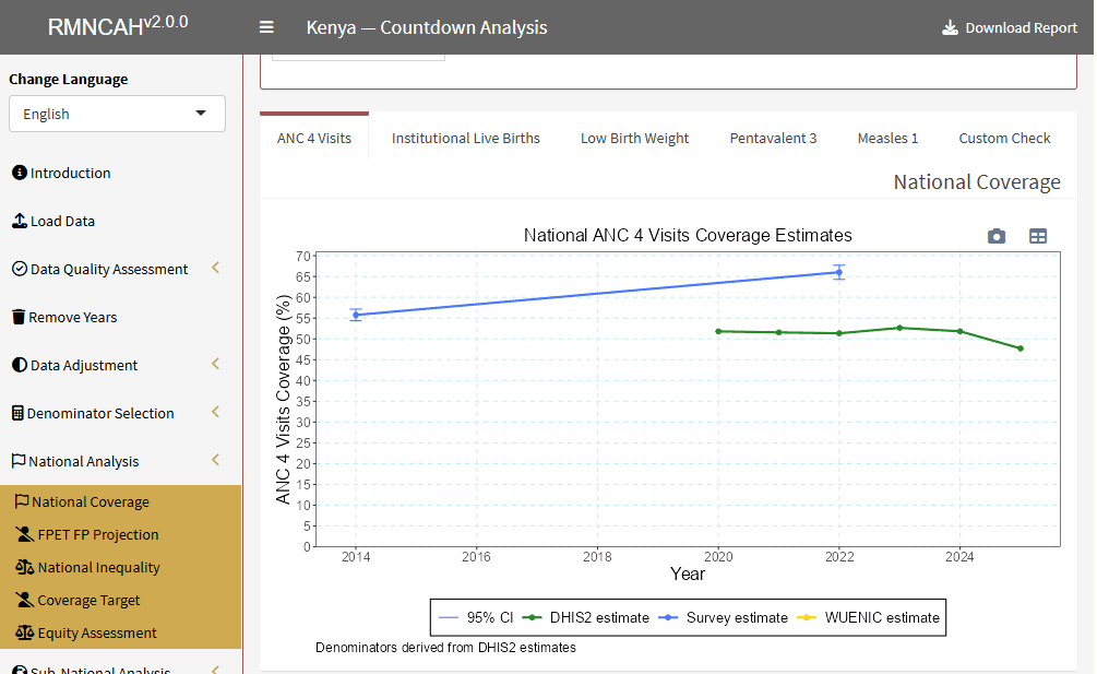
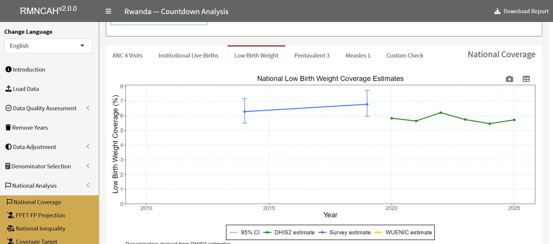
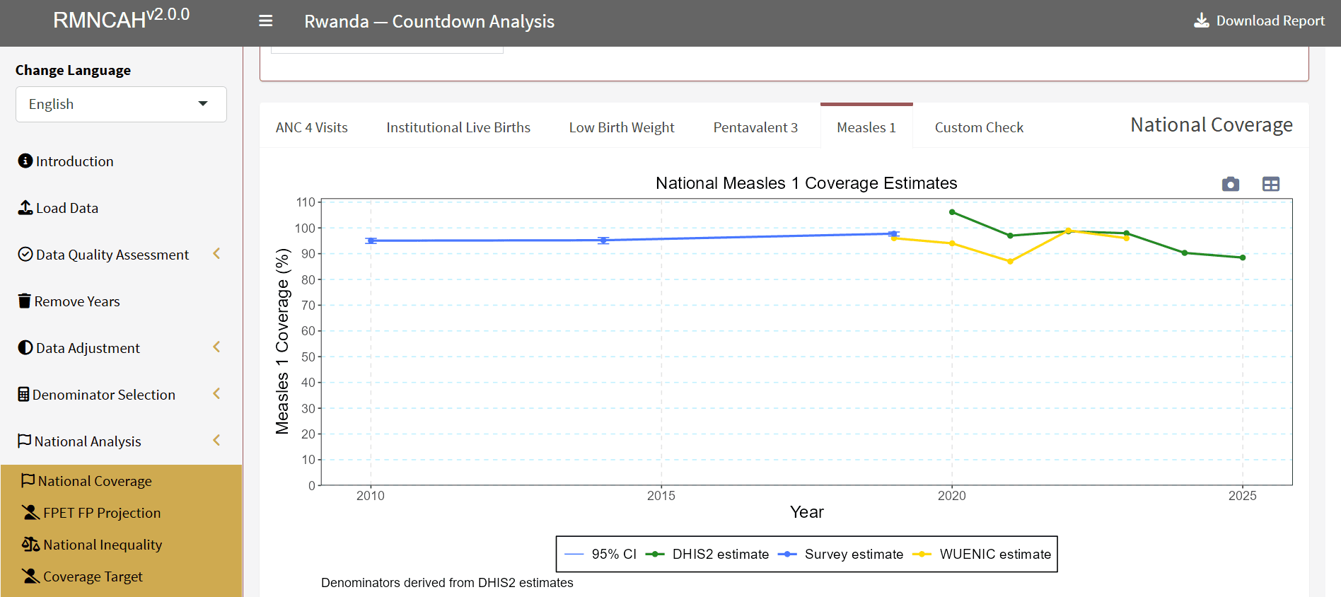
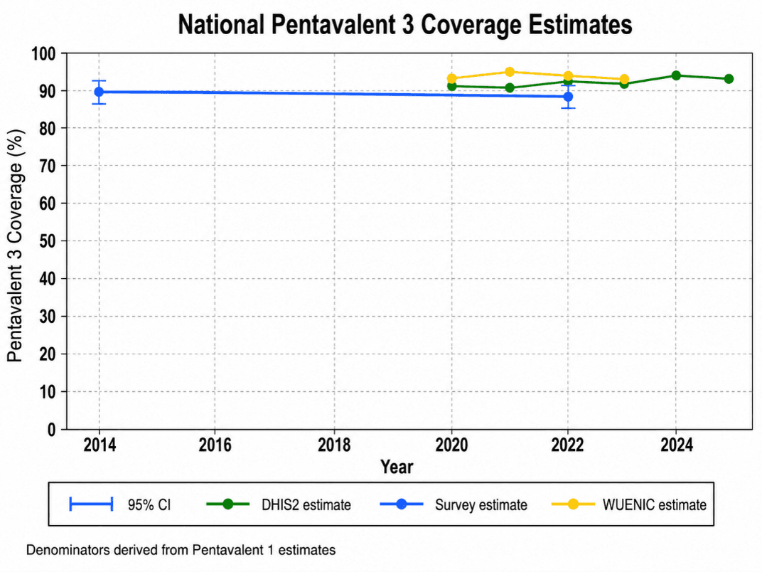
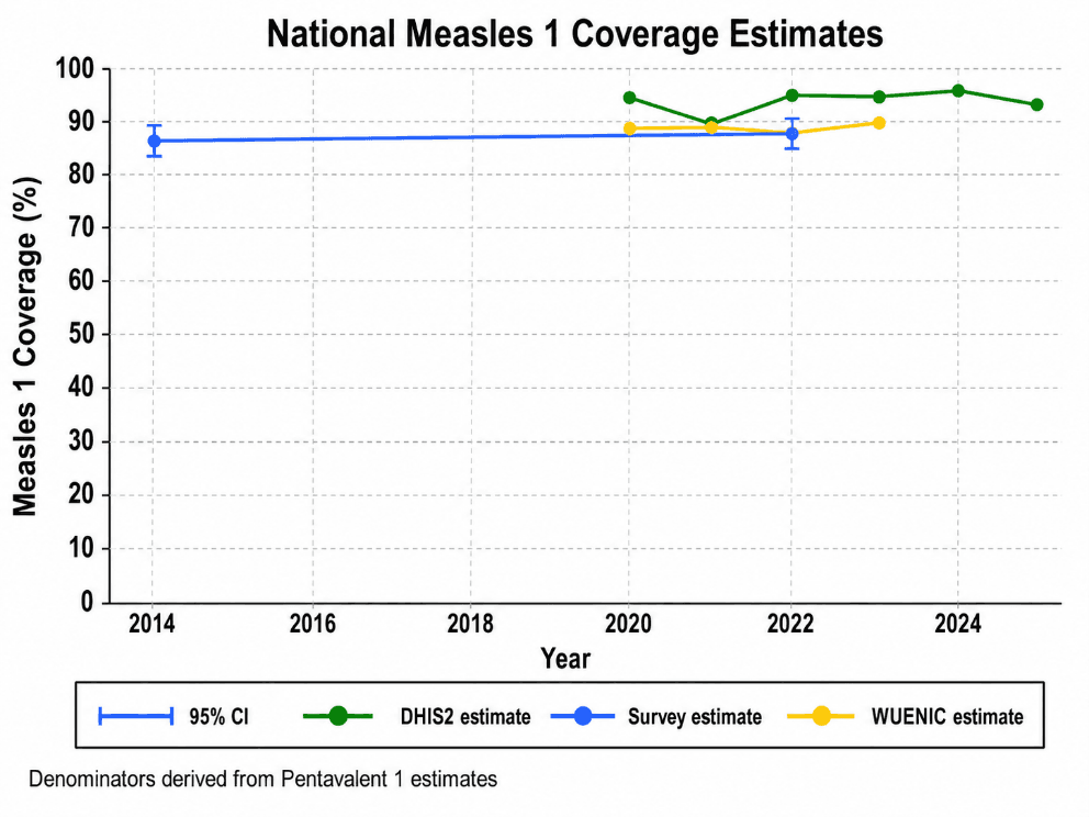
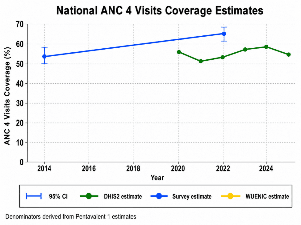
The national trend graph shows annual facility-based coverage, usually from 2020–2025 or the latest available period.
-
Survey estimates are overlaid using at least last two household surveys, with confidence intervals where available.
-
For immunization indicators, WUENIC estimates may also be shown as an external reference.
-
Is facility-based coverage increasing, declining, or stagnating?
- Are the last two survey estimates consistent with the facility trend?
- For immunization, do facility data, survey data, and WUENIC tell a similar story?
- Is the country moving toward the relevant national or global target?
Interpretations
- If facility and survey estimates are close, confidence in the trend is stronger.
- If facility estimates are much higher than survey estimates, check for denominator issues, over-reporting, or incomplete private-sector adjustment.
- If facility estimates are much lower than survey estimates, check for incomplete facility reporting, missing outreach services, missing private-sector data, or extraction problems.
- Wide survey confidence intervals mean the survey point should be interpreted cautiously.
- Coverage above 100% should be treated as a data-quality signal, not as strong programme performance.
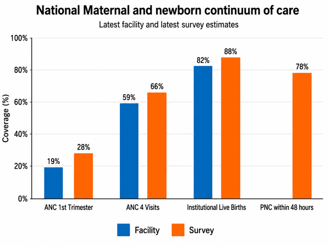
Maternal and Newborn Continuum of Care
-
The maternal/newborn continuum graph follows the pathway from pregnancy to delivery and the immediate postnatal period.
-
Typical indicators include:
- First-trimester ANC
- ANC4+
- Institutional live births
- Post-natal care within 48 hours
Interpretation
-
The graph helps identify where women and newborns are being lost along the care pathway.
-
Low first-trimester ANC suggests delayed entry into pregnancy care.
-
Gap between first-trimester ANC and ANC4+ suggests weak continuity of antenatal care.
-
High ANC but lower institutional live births may indicate barriers to delivery care, such as distance, transport, cost, referral gaps, or perceived quality of care.
-
High institutional live births but low postnatal care suggests missed opportunities before discharge or weak follow-up after birth.
-
If facility and survey estimates are consistent, the interpretation is stronger.
-
If facility and survey estimates differ, check indicator definitions, reporting completeness, denominator quality, private-sector reporting, and survey timing
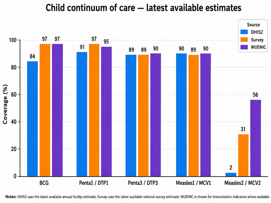
Child Continuum of Care
- The child continuum graph focuses on child health contacts after birth, especially immunization and child illness services.
- Current priority indicators may include:
- DTP3/Penta3
- MCV1/Measles1
- BCG, DTP1, MCV2, PCV3, rotavirus, full immunization, zero-dose, ORS, and pneumonia care-seeking where available.
- The graph helps assess whether children remain in contact with services after birth and access to essential immunization services.
Interpreting the Child Continuum of Care
- A gap between DTP3/Penta3 and MCV1 may suggest dropout after the early infant vaccine series.
- Low MCV1 compared with DTP3 may point to weak follow-up, missed opportunities, caregiver mobility, or reporting gaps.
- For immunization indicators, compare facility data, survey estimates, and WUENIC.
- If all three sources align, confidence in the immunization coverage pattern is stronger.
- If facility data are higher than both survey and WUENIC, check denominators, reported doses, and possible over-reporting.
- If facility data are lower than survey or WUENIC, check completeness of reporting, outreach data capture, private-sector reporting, and extraction issues.
Subnational Heatmaps
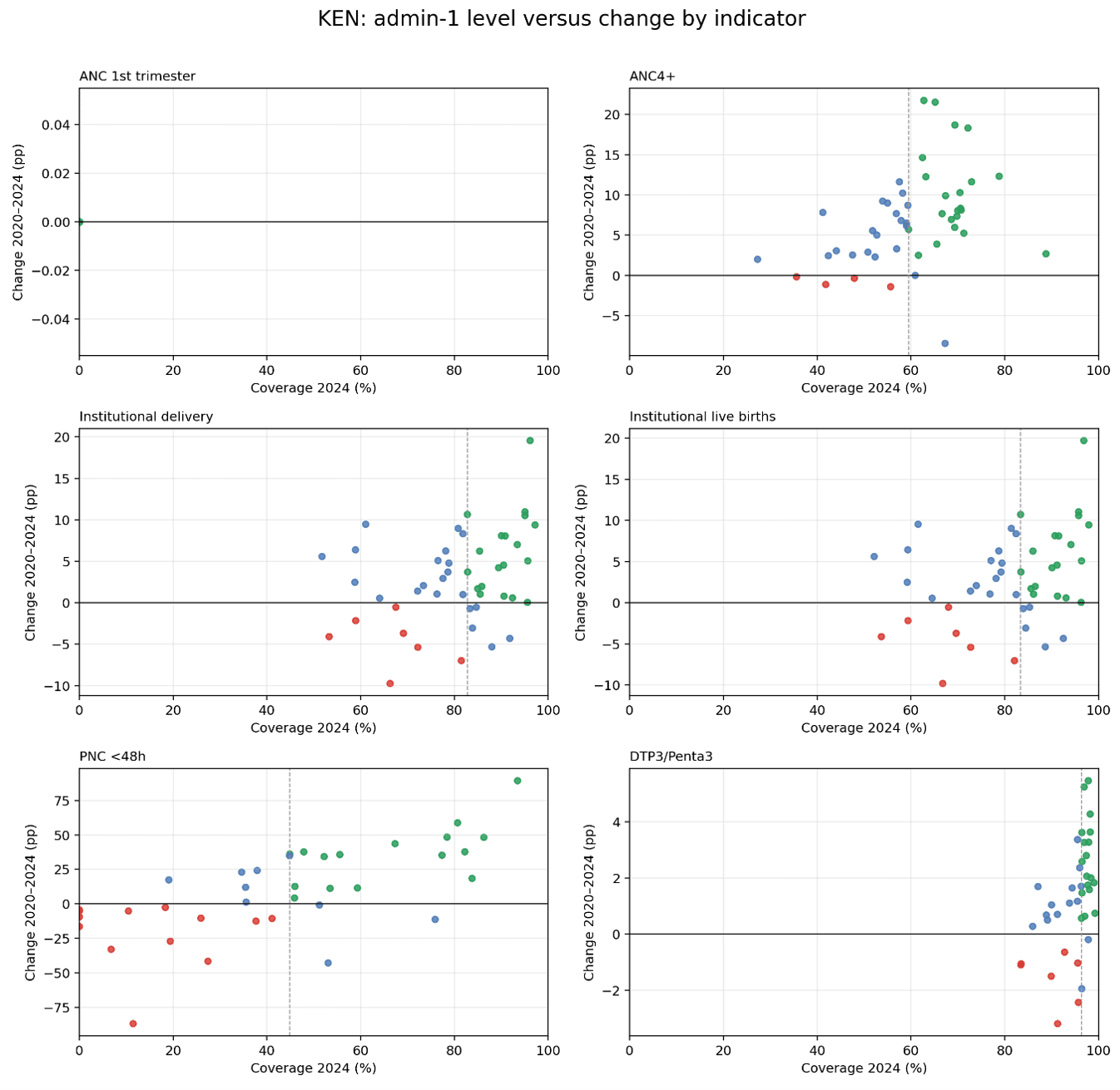
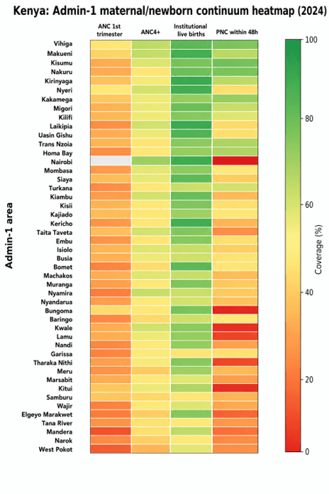
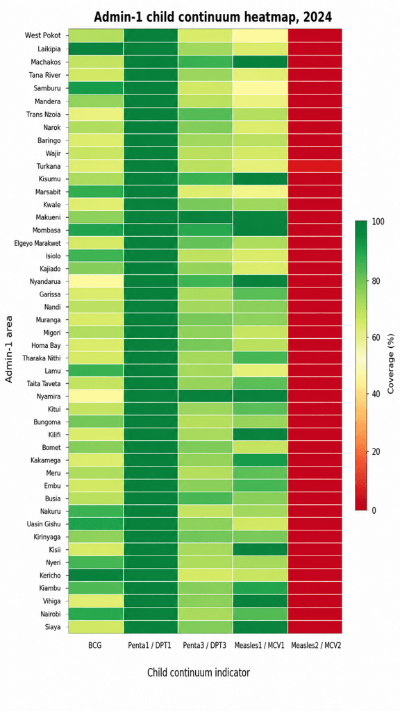
- Heatmaps show variation across subnational units.
- The colour scale should be read as:
- Red = lower coverage / weaker performance.
- Yellow/orange = intermediate coverage.
- Green = higher coverage / stronger performance.
- Read the heatmap across rows to understand how one subnational area performs across multiple indicators.
- Read the heatmap down columns to understand how one indicator varies across subnational areas.
Continuum of Care at Subnational Level
- A row with many red cells suggests broad service delivery, access, or reporting challenges in that area.
- A column with many red cells suggests that the indicator is a national bottleneck.
- A mixed row suggests that the area performs well for some services but poorly for others.
- Green areas may provide useful lessons, but they should still be checked for data quality.
- Red areas should trigger deeper review, but low values may reflect reporting or denominator problems rather than true low coverage.
Best and Worst Subnational Performance
- Best and worst areas should not be classified using latest coverage alone.
- Interpretation should consider:
- Latest coverage level.
- Change over time.
- Reporting completeness.
- Denominator quality.
- Implausible values above 100%.
- A useful classification is:
- High and improving – strong performance; potential learning area.
- High but declining – early warning area.
- Low but improving – progress area needing continued support.
- Low and declining – priority area for review and corrective action.
- Areas with coverage above 100% should be flagged and excluded from best performance rankings unless data are reviewed.
- Countries should examine whether poor performance is concentrated in a few areas or widespread across many areas.